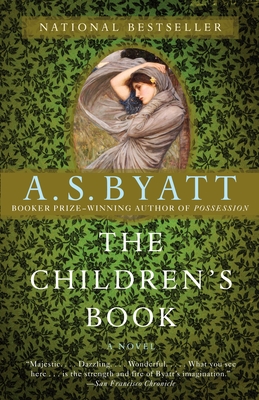

Okay, I cheated a bit on this one because I said I would avoid those that used the same stock photo. But it's not just that, I swear!
Look at the fonts they use. Very simple, Times New Roman-esque. (Except MUCH prettier than Times New Roman, because I hate that font.) Both have a circle on the cover in an attempt to draw the eye to it.
I like the Twilight of Avalon cover better. Something about the busy background of The Children's Book doesn't make me want to look at it, whereas Twilight of Avalon is a bit more sophisticated.
