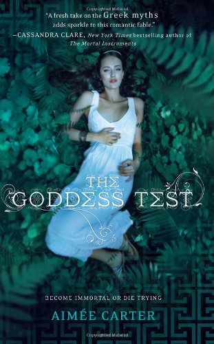
I love the image for this book; I think it captures the book's essence perfectly, and the picture itself is absolutely gorgeous.
But there's so much TEXT! It takes away from the cover; we could have just used the title and the author's name and maybe the tagline, and not where they are - rearranged a bit, me thinks. I think Cassandra's quote should have been saved for the back of the book, even if it is an attempt to make people pick it up.
