I've been thinking a lot about book covers lately, especially bad covers.
This post is to honor those bad covers that happen to good books.


Enchanted Ivy:
I loved Enchanted Ivy, and the cover could have been really cool, even along the same lines with this one. But her legs. Where did they go?! There's not a place in the statue for them to disappear into, and... why? Why not have her stand next to the statue?
Mistwood:
Mistwood was a beautiful high fantasy novel and the cover makes it look like a weird paranormal romance; the fade-out girl, the weird texture of the trees on above the castle, none of it really works. I'd have loved to see a scene from the book mapped out, or something painted, something artistic - think of the stereotypical Tor cover.
Fat Cat:
The original Fat Cat cover was gorgeous and subtle, and this one just endorses every stereotype for covers of books with overweight protagonists. Bonus: it's not even a pretty stereotype!


The Nightshade series:
It pains me to talk about these covers because the original cover for Nightshade was a work of art on its own and this is just a faded out photoshopped mess. I don't know what they were thinking, but not only are they stereotypical, but they're hideous.


All of Simone Elkeles' books:
I've read a good handful of her work now and it's all fairly good. So why do they stick with this awkward-couple-on-a-black-photograph theme? I don't even know what to replace it with, but I know this is not a pretty thing!


The Hourglass series:
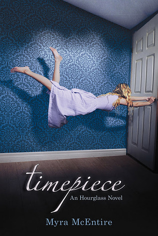
The covers for this series aren't terrible; visually, they're very pretty, as far as photographs go. But they don't line up with the book series very well, and the placement of the type and such on the cover seems weird to me. I get a very big Alice in Wonderland vibe from these covers, and while Hourglass was good, the book was nothing like that, despite the wonderland of time travel.


The Bloodlines series:
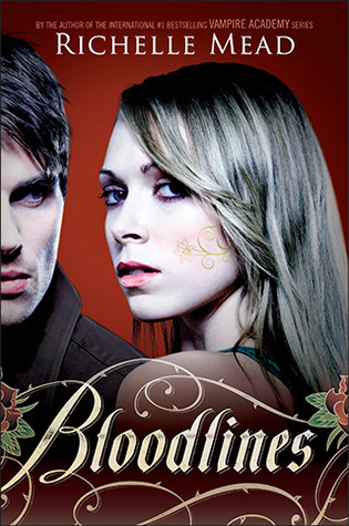
I was sticking to books that I had read up to this point, but I couldn't pass up the chance to complain about Richelle Mead's Bloodlines series. I'm a huge fan of her Vampire Academy series, and while the covers for those aren't perfect, they're better than this mess. I just have no idea what's going on - the colors are weird, the font is terrible, they're poorly Photoshopped... I don't know what they were thinking.
What books am I forgetting?